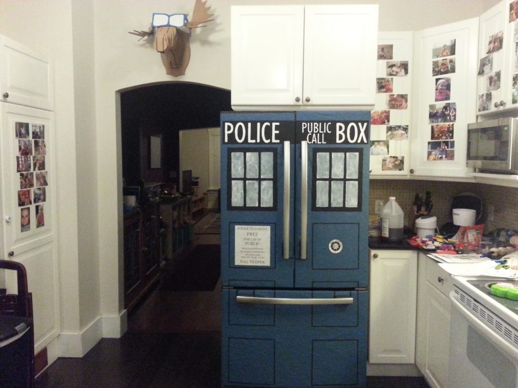
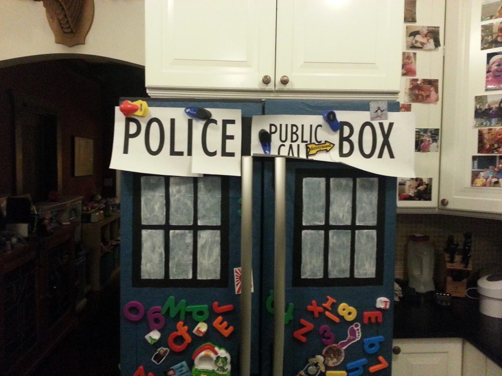
I made my fridge into a TARDIS! I know that you can buy kits to do this, but I decided to try to make one. I used packing paper, some paint, and lots of measuring.
Colors:
Blue: Empire Fleet Blue, Flat (from Lowe’s)
Black: generic poster paint, Flat (I’d suggest not using poster paint – it’s water soluble
White: semigloss White
Fonts:
Gill Sans MT (POLICE PUBLIC CALL BOX)
Gill Sans MT Condensed (POLICE PUBLIC CALL BOX (on side))
Times New Roman (POLICE TELEPHONE / FREE / FORE USE OF / PUBLIC)
Gill Sans MT (ADVICE & ASSISTANCE / OBTAINABLE IMMEDIATELY / OFFICER & CARS / RESPOND TO ALL CALLS)
Calibri (PULL TO OPEN)
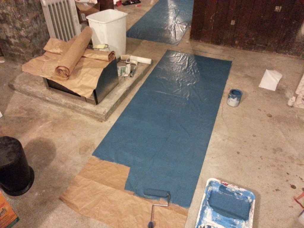
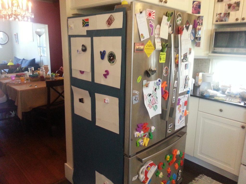
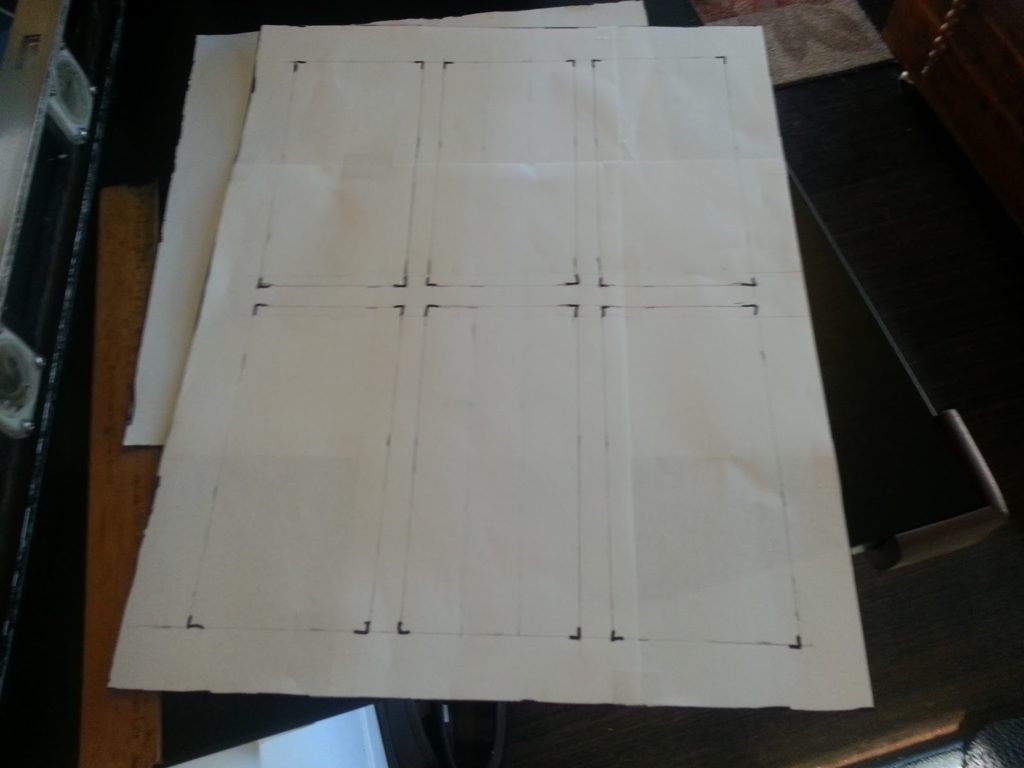
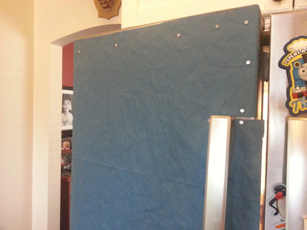
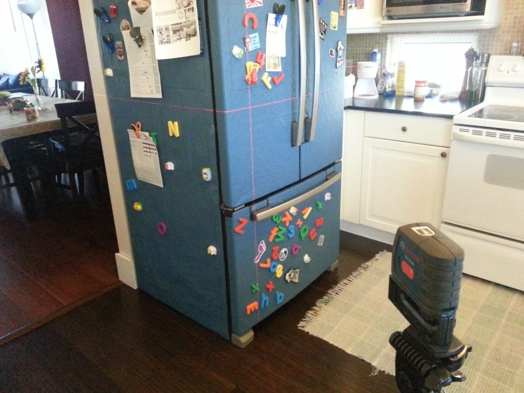
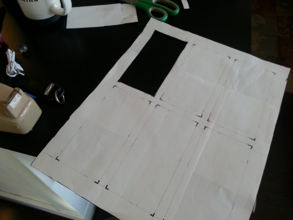
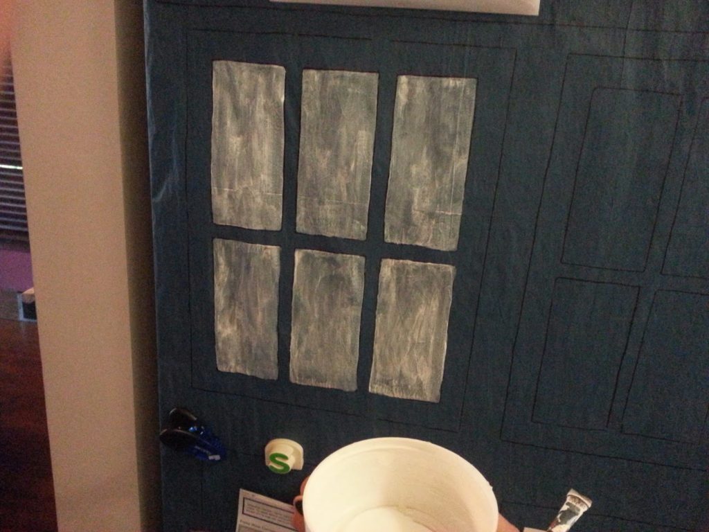
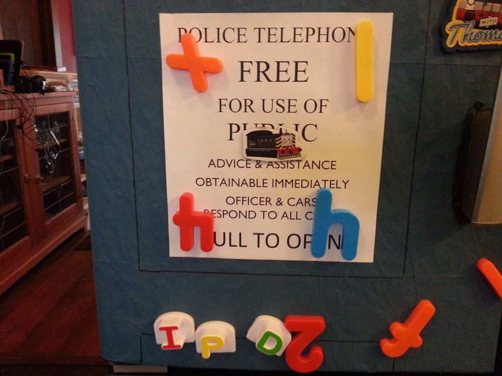
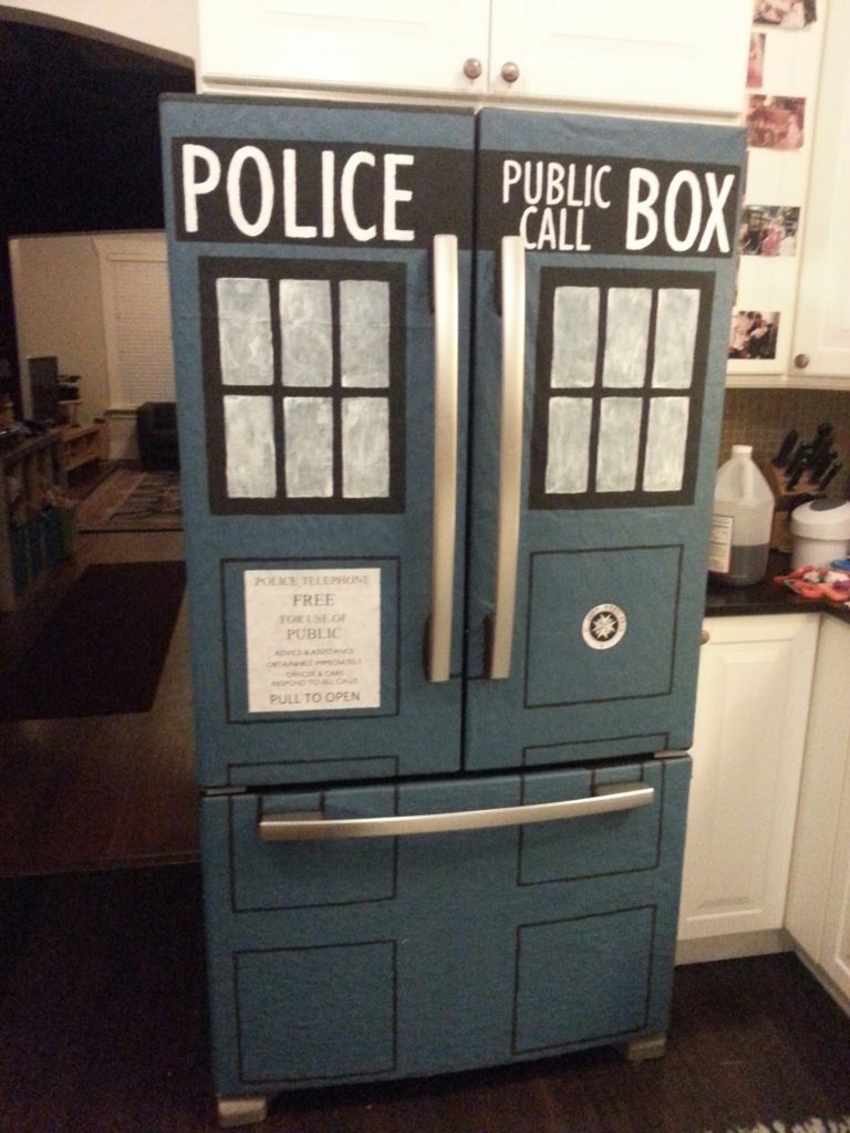
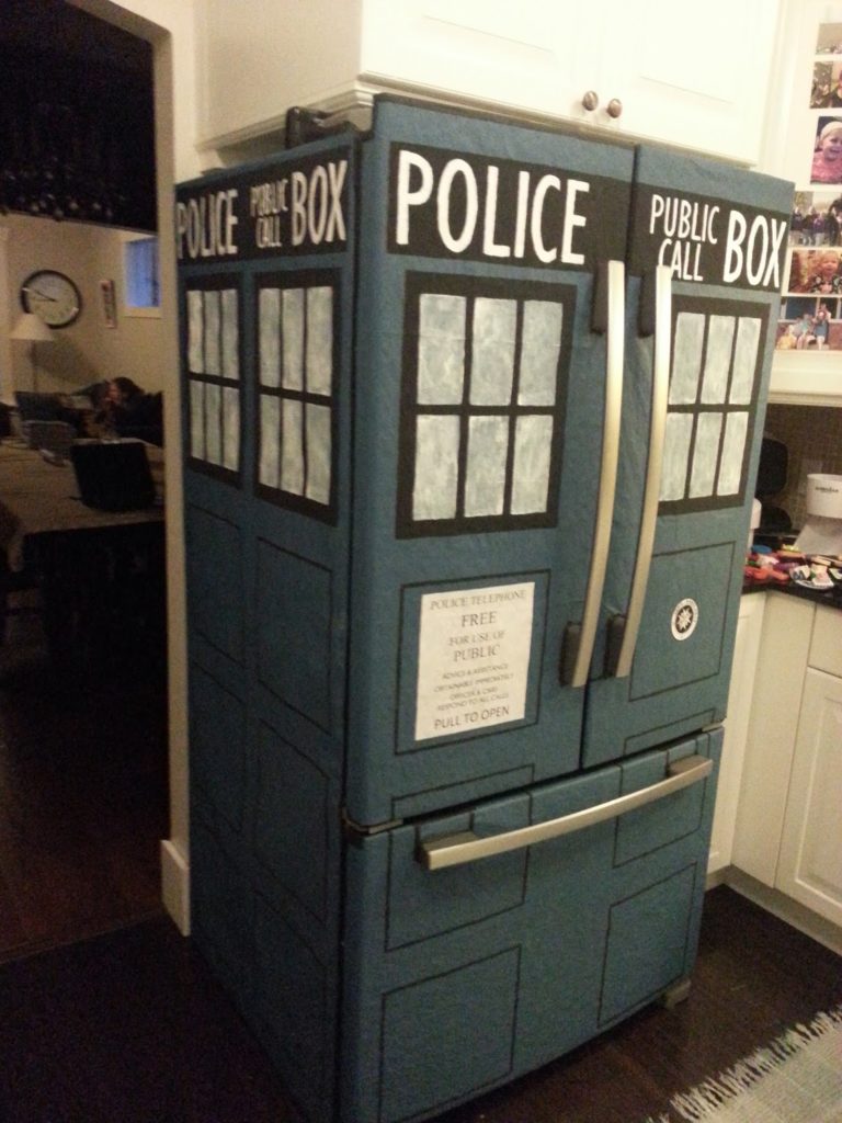
The finished product!I had lots of packing paper from past Amazon orders. I rolled them out on the floor and painted them with a small roller. I found a couple suggestions for colors, and took the easiest one. Lowe’s “Empire Fleet Blue” in flat.Hanging the first paper on the fridge. I made some guides to help make the different panels. I had a couple reference models in my house which I used to determine rough dimensions.A closeup of the window guide.I used magnets to hold each panel in place, then taped the edges with black tape. I originally wanted to take the door handles off, but I couldn’t figure it out and decided against it.I used the guides to trace an outline of each section.My neighbor had a laser level, which I decided to take advantage of when trying to line up the panels on both sides.After all the outlines were traced, I cut out the windows on my guide to help make the individual windows.First windows painted! I decided I liked the translucent look and did not add any extra coats.I figured out the font for the top (Gill Sans MT), and then printed out the letters on my printer. Once I had the sizing, I used an x-acto knife to make a stencil and traced them in the right spot for painting.It took a while – it turned out I needed 2 sets of stencils, one for each side. Since it wasn’t as wide, I had to use “Gill Sans MT Condensed” for the side.By the time I got to the sign, I just researched the fonts and printed them on paper that I cut to size. I used spray glue to attach it. The fonts I used were: Times New Roman, Gill Sans MT, and Calibri.I decided to add the St John’s Ambulance logo as well. I found a bunch of examples online.The finished product! It took much longer than I was expecting, but it was something artistic to do when I needed a distraction. Maybe we’ll find more room in there for milk now?The base blue paint is rather sturdy. Unfortunately I used some poster paint for the black, so it is not exactly water safe. I used a semi-gloss white for the letters/windows, which gives it an ever-so-slight glowing effect next to all the flat colors. K9 approves!